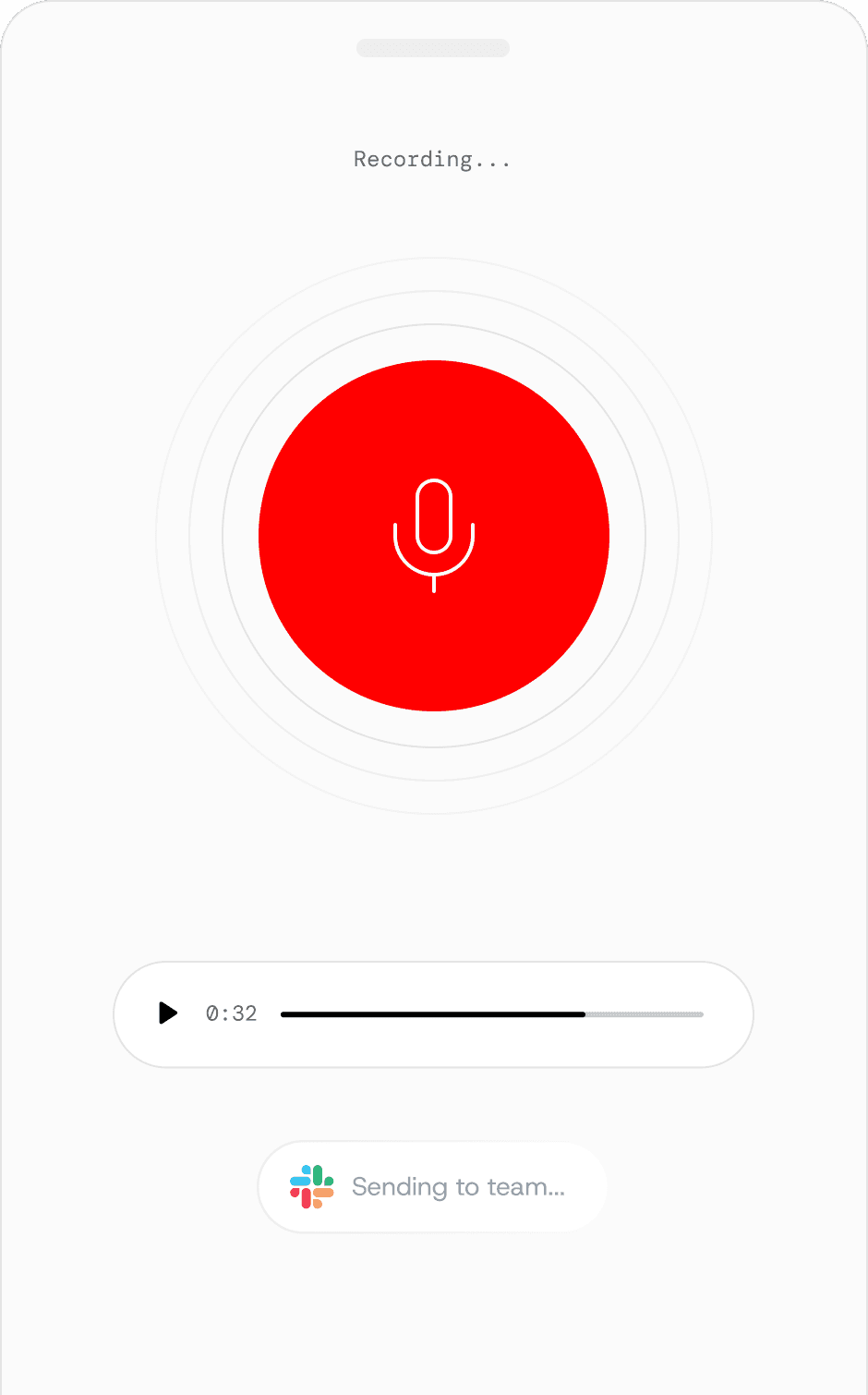
Dobbin is a pre-seed start-up building an AI thinking partner thats purpose-built for your business. As Founding Designer, I work 0→1 across brand, strategy, and product design.
dobbin ai
2026
founding designer
Credit: timo bontenbal, video animation
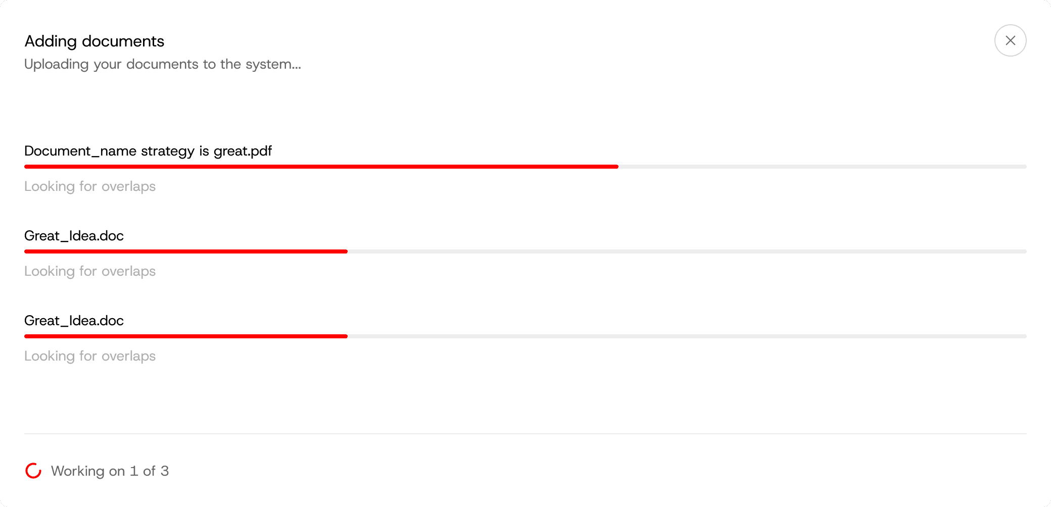
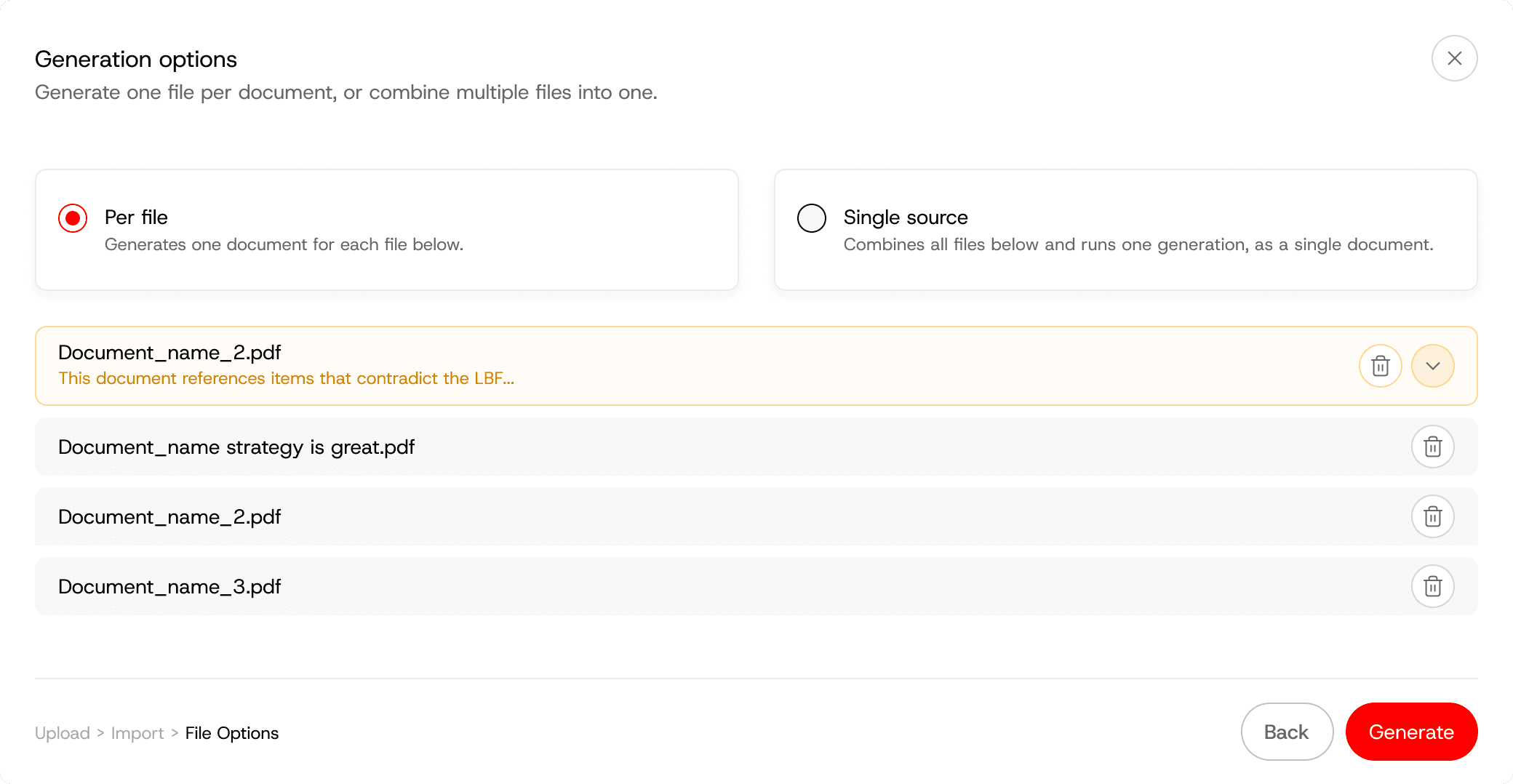
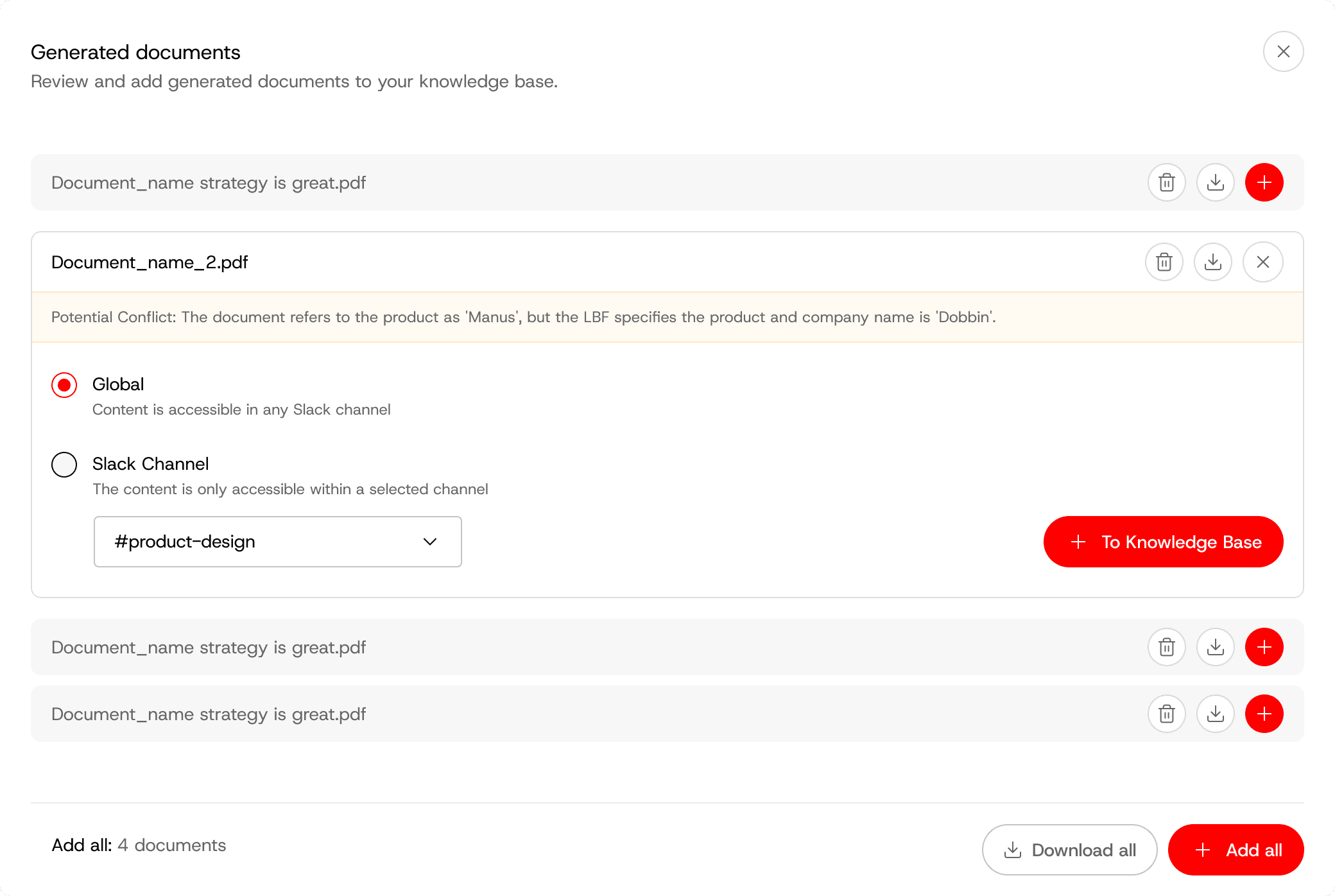
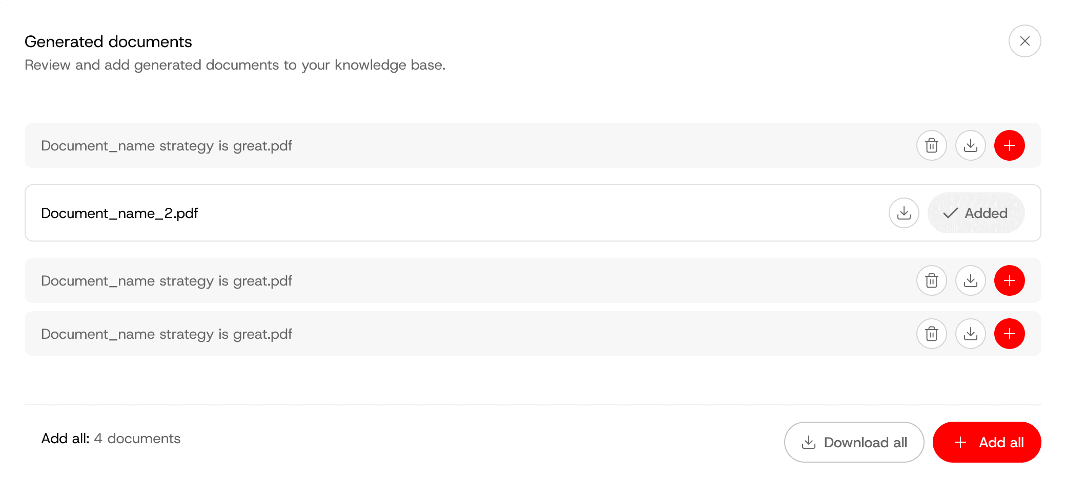
Dobbin's core UX is built around a self-learning brand foundation and knowledge base. I turned what was a 56 page Googledoc into a card based knowledge and management system with upload, edit and gap analysis.
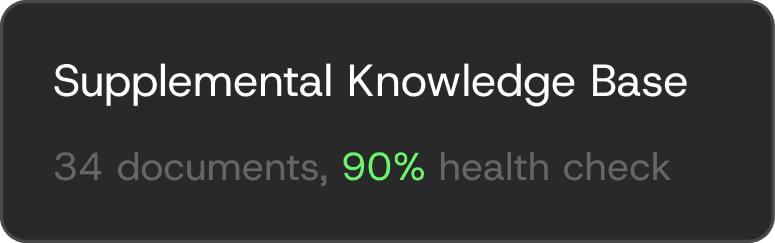
The knowledge base below prioritizes the most important gaps and learnings, with quick-tap filters and large iconography to show which documents need attention and which are best powering the system.
Working directly with customers and our sales team, I continue to iterate on the UX. The biggest learning: as AI gets smarter, having a simple way to see which knowledge is actually powering your team's conversations becomes incredibly important.


Click to upload or drag and drop


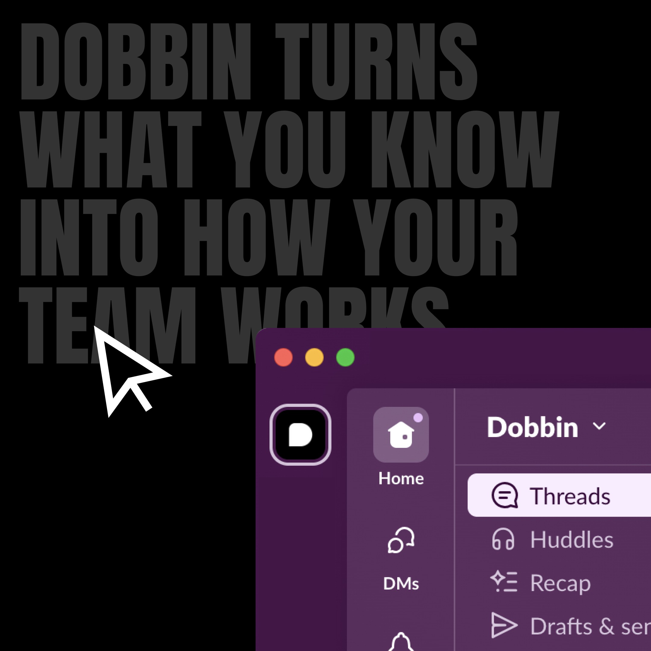
We're continuously iterating on how to help new customers understand and utilise Dobbin.
To move users from interest to intent, I designed simple flows, step-by-step guides and explainer diagrams. Using Cursor, I was able to prototype the more interactive flows quickly to demo to the team.


As well as delivering features, it’s also important to present a vision of the future, this helps spark new conversations, reduces ambiguity, and helps clarify priorities.
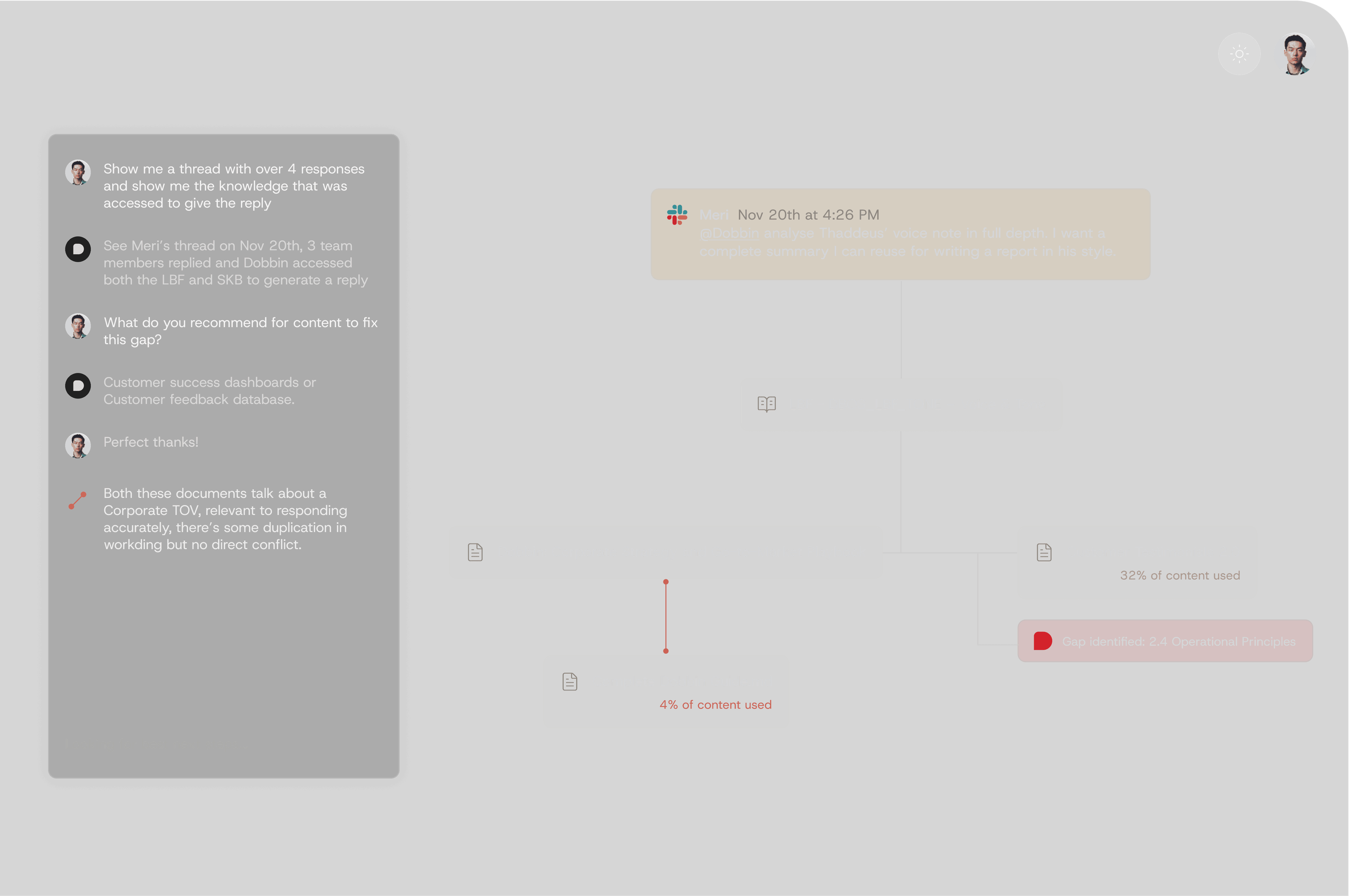
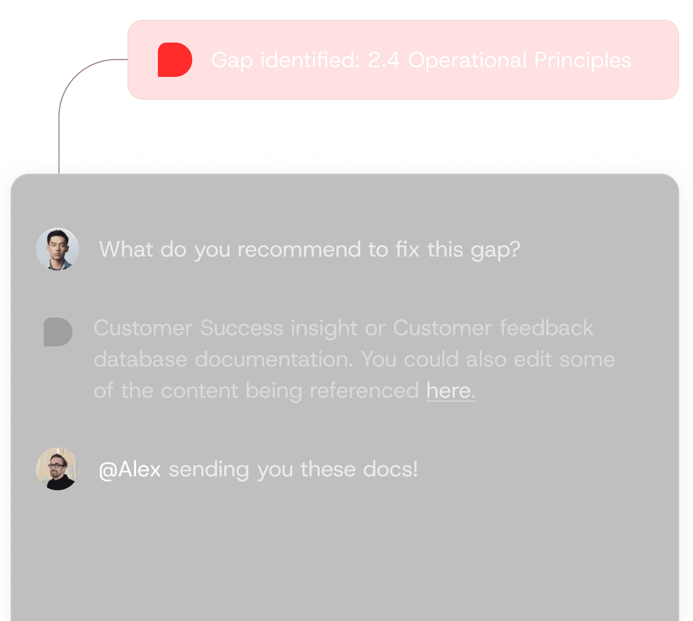
The examples below explore a canvas based UX, with a deep-dive into Dobbin's usage and the gaps it identified.
Prototyping and building. My design process enables me to move fluidly between FigJam, Figma, and tools like Cursor, I rapidly develop ideas and translate them into outputs that are as close to production ready as possible.
Posthog > Usage data and screen recordings
FigJam > Planning, structural architecture.
Figma > Mockups, quick flows, messy visualisation of the proposed future
Cursor > work setup, prompt building, screenshots, design-edit mode and Figma MCP.
tailwindcss, next.js, shadcn
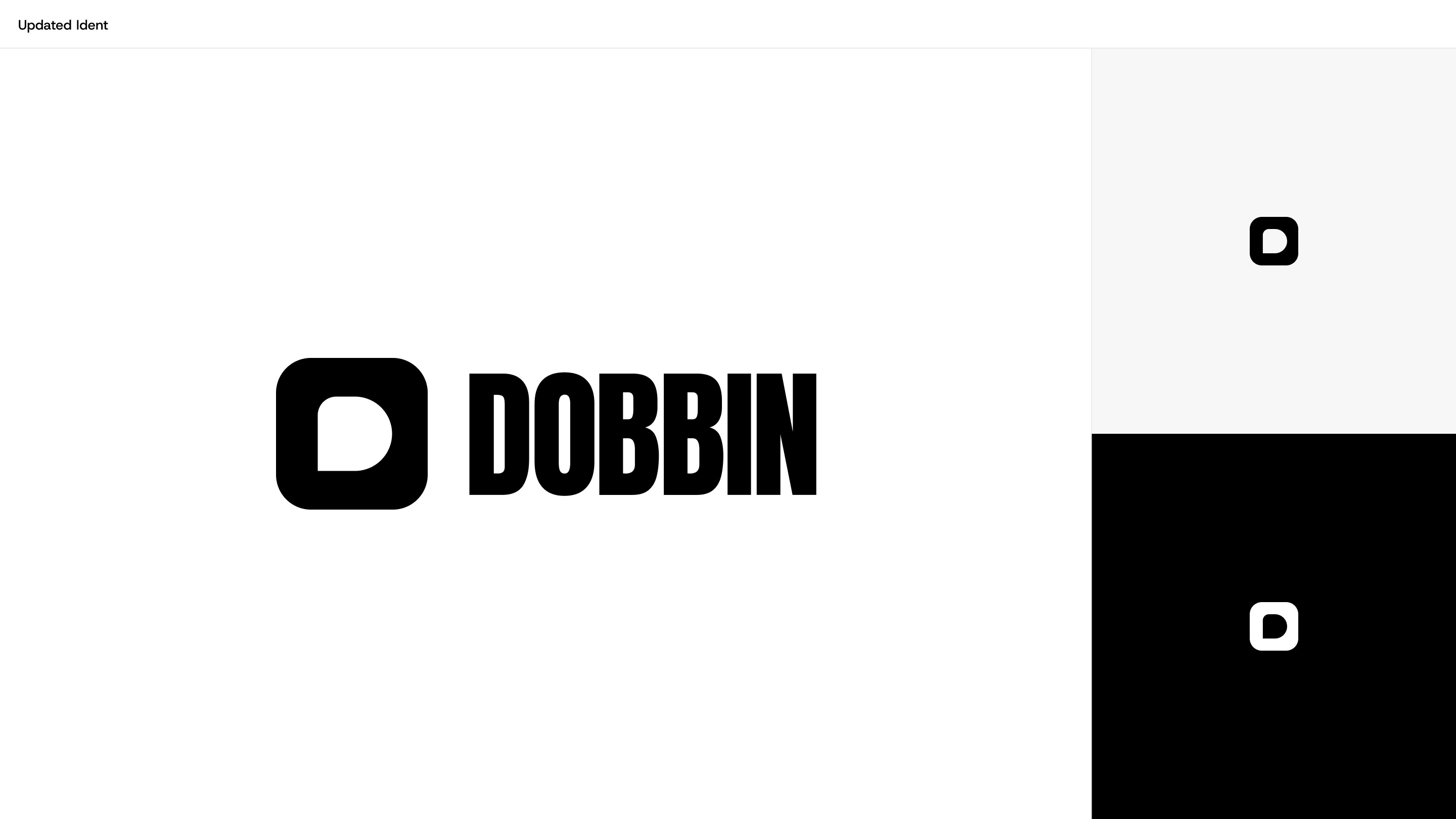
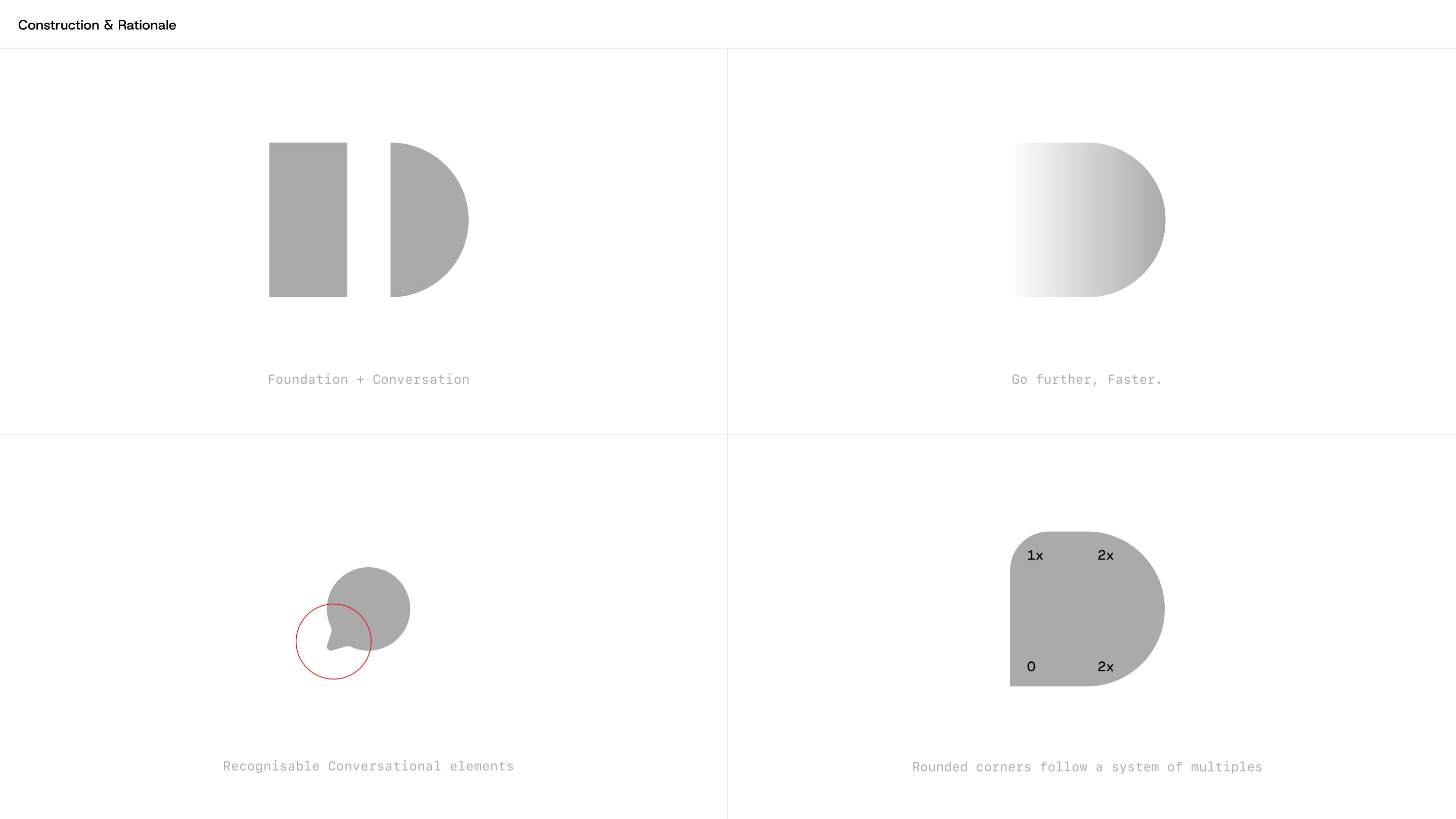
Brand and visual language. To create Dobbin’s identity I started by workshopping 3 core principles; conversational, partnership and action.
The "D" icon represents these principles, it's strong silhouette showcases Dobbin’s bold personality, and sets the tone for the wider visual language.